TL;DR: Your 6-Metric Dashboard
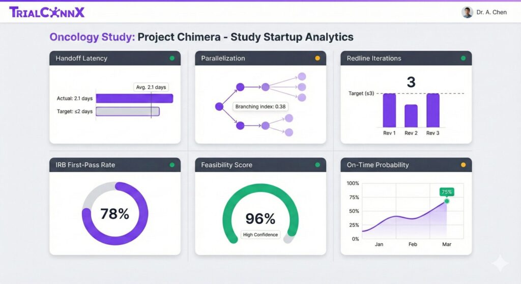
You don’t need 20 metrics to track study startup. You need six: handoff latency (≤2 days between stages), parallelization index (≥0.35), redline iterations (≤3 cycles), IRB first-pass rate (≥75%), feasibility completeness (≥95%), and on-time probability (≥70%). Together, they show bottlenecks, workload, and risk without overwhelming your team.
Why Most Site Dashboards Fail (And What Yours Should Do Instead)
You’re tracking 15 different metrics across three sponsor portals. Your spreadsheet has 37 columns. You update it every Friday, and by Monday, you’ve already forgotten what half the numbers mean.
Sound familiar?
Here’s the problem: most site dashboards track everything except what matters. They show what already happened, not what’s about to go wrong.
The data backs this up. According to a 2024 analysis of NCI-designated cancer centers, study activation times range from 78 to 313 days. That’s a 235-day spread at institutions doing similar work.1 The median time? 140.5 days for studies meeting the 70% activation threshold.2
But here’s what those numbers hide: roughly 40% of that time is idle. Waiting for handoffs. Waiting for someone to respond. Waiting for the next stage to start.
Your dashboard isn’t showing you that.
Over 85% of clinical trials face delays.3 For Phase III trials, every day of delay costs $36,000.4 But for sites? The cost isn’t just financial. It’s your PI losing patience. It’s your coordinator burning out. It’s that sponsor who won’t send you the next protocol.
Most dashboards show lagging indicators. What’s already done. They don’t predict what’s coming. You realize you’re behind schedule only after you’ve missed the milestone.
What sites actually need: leading indicators. Early warning signals that let you fix problems before they cascade.
❌ Typical Site Dashboard
- 20+ metrics across multiple spreadsheets
- Lagging indicators only (what already happened)
- No SLAs or target benchmarks
- Updated manually once a week
- Takes 45 minutes to update
- Nobody looks at it except during audits
✅ Minimal Viable Dashboard
- 6 metrics in one place
- Leading indicators (predict delays)
- Clear benchmarks per metric
- Real-time or auto-calculated
- Takes 10 minutes to review weekly
- Your team actually uses it
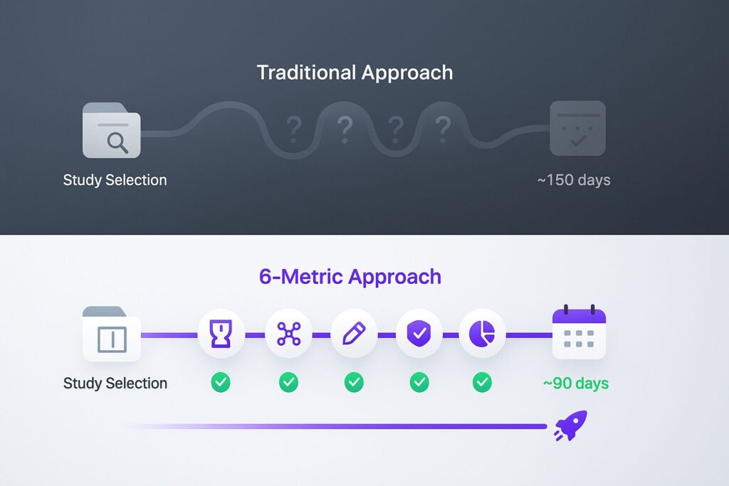
The NCI recommends a 90-day “time to activation” as the gold standard.5 Most sites aren’t hitting it. The 2018 AACI benchmarking survey found a median activation time of 167 days across 61 cancer centers.6
The difference between 90 days and 167 days? It’s not lack of effort. It’s lack of visibility into the right metrics.
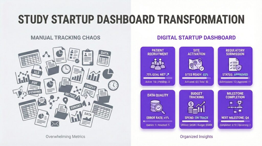
The 6 Cards That Make Up Your Minimal Viable Dashboard
Each metric answers one critical question. Track all six, and you’ll know if you’re on track before anyone asks.
1. Handoff Latency (Stage → Stage)
What it is: Time between completion of one stage and start of the next.
Why it matters for sites: Hidden delays accumulate here. If contracts close on Monday but regulatory doesn’t start until Thursday, you’ve lost three days. Do that five times during startup, and you’ve lost 15 days without anyone noticing.
How to track:
End Date of Stage A – Start Date of Stage B = Handoff Days
Benchmark: ≤2 business days
What “good” looks like: Contracts close Friday afternoon. Regulatory starts Monday morning. Handoff latency: 1 business day.
Site-specific tip: Map your handoffs across teams. Is feasibility waiting on the sponsor to respond? Is regulatory waiting on you to schedule the kickoff? Most sites don’t know where the delays actually happen because they track stage completion, not stage transitions.
“We thought we were slow at regulatory review. Turns out, we were fast, but contracts wasn’t handing off for 8 days after signature. Once we saw that, we fixed it in two weeks.”
— Regulatory Coordinator, 450-bed Academic Medical Center
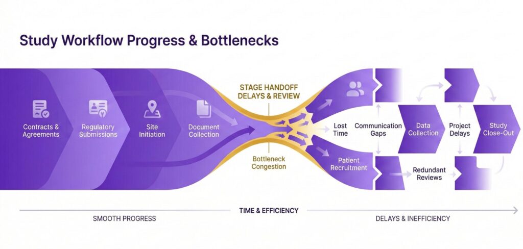
Typical Handoff Latency
Above target
Target Handoff Latency
Saves 15+ days per study
2. Parallelization Index
What it is: Percentage of tasks running simultaneously instead of sequentially.
Why it matters for sites: You don’t have time to wait. If site training can happen while IRB is in review, you save weeks. If budget negotiations can run parallel to contract redlines, you save more.
The problem? Most sites work sequentially by habit, not necessity.
How to track:
(Overlapping Task Days) ÷ (Total Task Days) = Parallelization Index
Benchmark: ≥0.35 (35% of work runs in parallel)
What “good” looks like: Budget negotiations happen while regulatory preps the IRB submission. Pharmacy starts investigational product planning during feasibility. Training materials get developed before IRB approval (because you know it’s coming).
Site-specific tip: Look for tasks that don’t actually depend on each other. Can your pharmacy review the protocol before the budget is finalized? Can you draft informed consent while waiting on contract signature? Most sites serialize tasks that could run concurrently.
Sequential Approach (Index: 0.18)
Total Timeline: 62 days
- Contracts: Days 1-14
- Budget: Days 15-24
- Regulatory: Days 25-45
- Training: Days 46-55
- Activation: Days 56-62
Parallel Approach (Index: 0.42)
Total Timeline: 39 days
- Contracts: Days 1-14
- Budget: Days 8-17 (overlaps contracts)
- Regulatory: Days 12-32 (starts during contracts)
- Training: Days 28-37 (starts before IRB approval)
- Activation: Days 38-39
23 days saved
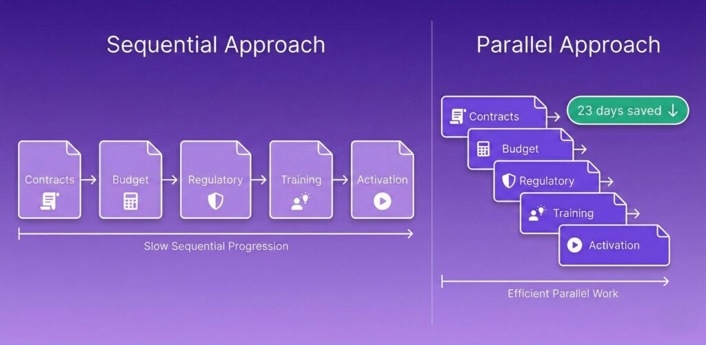
A community site managing eight studies increased their parallelization from 0.22 to 0.41 by starting training prep during regulatory review. Result: 12-day average time savings per study. Across eight studies, that’s 96 days (more than three months) of capacity gained.
3. Redline Iteration Count (Contracts & Budgets)
What it is: Number of review cycles for contracts and budgets before final signature.
Why it matters for sites: Every redline cycle adds 3-7 days. After four cycles, you’re looking at 12-28 days of delays. And here’s what nobody tells you: most of those delays aren’t about negotiation complexity. They’re about missing information upfront.
Academic medical centers currently take 8.12 months to activate studies compared to 4.37 months for independent sites (242% longer).7 A significant portion of that difference? Contract and budget cycles.
How to track: Count review cycles from first draft to final signature. Each exchange counts as one cycle.
Benchmark: ≤3 cycles
What “good” looks like: Draft → Sponsor review → Site legal revisions → Final signature = 3 cycles, completed in 14 days.
Site-specific tip: Track WHO causes delays. Is it sponsor legal every time? Your contracts office? Finance? Once you know the bottleneck, you can fix it. Maybe your finance team needs budget templates. Maybe sponsor legal needs pre-approved language. You can’t fix what you don’t measure.
Target Redlines
Avg 68 days to startup
High Redlines
Avg 81 days to startup
Excessive Redlines
Avg 94 days to startup
Those numbers compound. If you’re running 10 studies per year and averaging 5 redline cycles instead of 3, you’re adding 130 days of delay across your portfolio. That’s four months of lost capacity.
4. IRB First-Pass Approval Rate
What it is: Percentage of IRB submissions approved without major revisions.
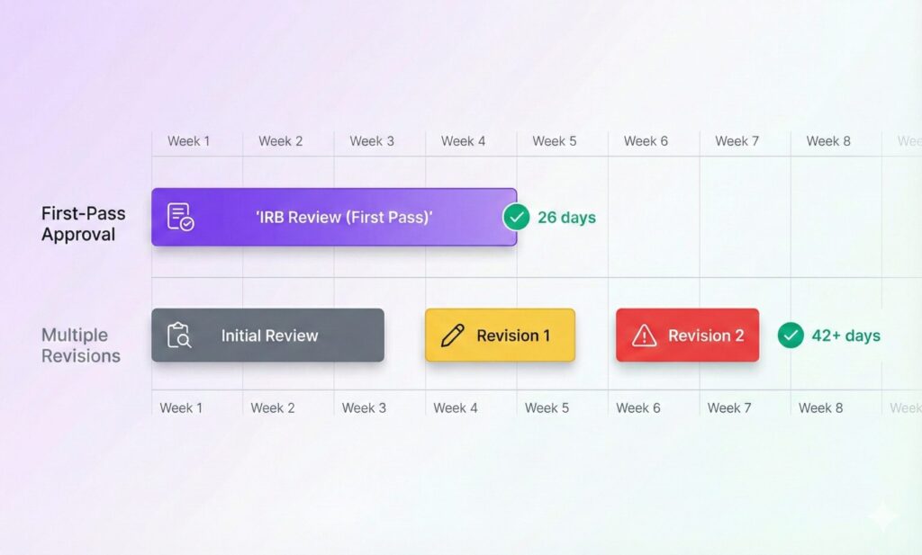
Why it matters for sites: IRB delays cascade. A first-pass approval means you’re activating in 4-6 weeks. Requiring revisions? You’re looking at 8-12 weeks. That’s a month of lost enrollment time.
IRB review times range from 13 to 116 days, with full board reviews taking 4-8 weeks.8 But here’s what matters: sites with high first-pass rates spend far less time in that range.
How to track:
(First-Pass Approvals) ÷ (Total Submissions) × 100 = First-Pass Rate %
Benchmark: ≥75%
What “good” looks like: Eight out of 10 submissions approved without major changes. The two that need revisions? Minor clarifications, not complete rewrites.
Site-specific tip: Track submission quality by coordinator. One person might have a 92% first-pass rate while another has 58%. That’s not a performance problem; it’s a training opportunity. Find out what the high performer does differently, then teach everyone else.
Before: 64% First-Pass Rate
Average IRB Timeline: 42 days
Revisions Required: 36% of submissions
Average Revision Cycles: 1.8
Studies Activated/Year: 14
After: 81% First-Pass Rate
Average IRB Timeline: 26 days
Revisions Required: 19% of submissions
Average Revision Cycles: 1.1
Studies Activated/Year: 18
That site didn’t hire more staff. They created a 15-point pre-submission checklist. It takes 20 minutes to complete. It saved 16 days per study on average.
5. Feasibility Completeness Score
What it is: Percentage of required feasibility fields completed on first submission.
Why it matters for sites: Incomplete feasibility questionnaires delay selection decisions. And here’s the thing: you don’t get selected for the studies you submit late or incompletely. Sponsors move on to sites that responded faster and better.
How to track:
(Completed Required Fields) ÷ (Total Required Fields) × 100 = Completeness %
Benchmark: ≥95%
What “good” looks like: All PI credentials, coordinator contacts, regulatory timelines, patient volume estimates, and equipment availability documented. If the sponsor’s form doesn’t ask for something you know they need, include it anyway.
Site-specific tip: Create a master feasibility template with EVERY field a sponsor might want. PI CV? Already attached. Regulatory timeline estimate? Already filled in. Lab capabilities? Already documented. When a feasibility request comes in, you’re adapting a complete template, not starting from scratch.
| Completeness Score | Avg Selection Decision Time | Follow-Up Questions | Selection Rate |
|---|---|---|---|
| 98-100% | 11 days | 0-1 | 68% |
| 90-97% | 16 days | 2-3 | 54% |
| < 90% | 22 days | 4-7 | 31% |
Sites submitting at 98%+ completeness got selection decisions nine days faster and were selected 37 percentage points more often than sites below 90%. That’s the difference between being on the study and watching it go to your competitor down the street.
6. On-Time Startup Probability
What it is: Composite score predicting likelihood of hitting your target activation date.
Why it matters for sites: This gives you ONE number to answer “are we on track?” When your PI asks, when your director asks, when the sponsor asks, you have an answer backed by data, not gut feeling.
How to calculate: Weighted formula based on the five metrics above plus current stage progress.
Example formula:
(Handoff Score × 0.20) + (Parallelization × 0.20) + (Redlines × 0.15) + (IRB Rate × 0.25) + (Feasibility × 0.20) = Risk Score
Convert to probability based on historical completion rates
Benchmark: ≥70% probability
What “good” looks like: All five metrics in green zones = 82% on-time probability. Two metrics in yellow = 64% probability. One metric in red = 41% probability.
Site-specific tip: If your probability drops below 60%, escalate immediately. Don’t wait for the sponsor to ask why you’re behind. Identify the bottleneck, propose a solution, and communicate proactively. That’s the difference between a trusted site partner and one that loses future opportunities.
“We review on-time probability every Monday morning. When Study 2407 dropped to 58%, we didn’t panic. We looked at the dashboard, saw the bottleneck was waiting on sponsor budget approval, and escalated. Got it resolved in 48 hours.”
— Site Director, Community Research Institute
How to Build This Dashboard in Under 1 Hour
You don’t need a developer. You don’t need expensive software. Here’s exactly how to set this up using a spreadsheet you already have.
Map Your Study Stages (10 minutes)
List every stage from pre-award to activation. Your list might look like this:
- Pre-Award / Feasibility
- Site Selection Confirmation
- Contract Negotiation
- Budget Finalization
- Regulatory Preparation
- IRB Submission
- IRB Approval
- Site Training
- Site Activation
Different sponsors might use different names. That’s fine. What matters is capturing the actual workflow at your site.
Time required: 10 minutes
Assign Metric Owners (5 minutes)
Who owns each metric? Be specific: names, not departments.
- Handoff Latency: Project Manager (Jane Smith)
- Parallelization: Study Coordinator Lead (Mike Chen)
- Redline Iterations: Contracts Manager (Sarah Johnson)
- IRB First-Pass Rate: Regulatory Coordinator (David Park)
- Feasibility Completeness: Business Development (Lisa Martinez)
- On-Time Probability: Site Director (reviews all metrics)
Ownership means they’re responsible for tracking the metric AND improving it when it goes off track.
Time required: 5 minutes
Capture Timestamps, Not Free Text (15 minutes)
This is critical. Use actual dates, not status descriptions.
Wrong: “Contract in progress”
Right: “Contract sent to sponsor: 3/15/2025”
Wrong: “Waiting on IRB”
Right: “IRB submitted: 3/22/2025”
Pro Tip: In Excel or Google Sheets, use date-formatted columns with data validation. This prevents people from entering “TBD” or “Waiting on sponsor.” You need real dates to calculate metrics.
For each stage, capture:
- Start Date
- End Date (or Expected End Date)
- Owner
- Status (Not Started / In Progress / Complete)
Time required: 15 minutes for template setup
Auto-Calculate Leading Indicators (20 minutes)
Use formulas to calculate your six metrics automatically. Here are the basic formulas:
Handoff Latency:
=NETWORKDAYS(B12, B13)
(End of Stage A to Start of Stage B, excluding weekends)
Parallelization Index:
=SUM(Overlapping_Days) / SUM(Total_Days)
Redline Iterations:
=COUNTA(Redline_Dates)
(Count each review cycle)
IRB First-Pass Rate:
=COUNTIF(Approval_Status,"First Pass") / COUNTA(Submissions)
Feasibility Completeness:
=COUNTA(Completed_Fields) / COUNTA(Required_Fields)
On-Time Probability:
=Weighted_Average_of_Above_Five_Metrics
Time required: 20 minutes (or instant with our template)
Display Only 6 KPI Tiles (5 minutes)
Create a dashboard view showing ONLY your six metrics. Hide the raw data on another sheet tab.
Your dashboard tab should show:
- Metric name
- Current value
- Target benchmark
- Status indicator (green/yellow/red)
- Trend arrow (improving/declining)
Everything else (detailed stage dates, task lists, notes) goes on supporting tabs. The dashboard is for decisions, not data entry.
Time required: 5 minutes
Set Weekly Review Rhythm (5 minutes)
Every Monday at 9:00 AM, review the dashboard. Takes 10 minutes once you have the habit.
Review agenda:
- Check on-time probability for each active study (2 min)
- Identify any metric in red or yellow (3 min)
- Assign action items to fix bottlenecks (3 min)
- Update expected activation dates if needed (2 min)
Block the time on your calendar. Make it recurring. Invite metric owners. Don’t skip it.
Time required: 5 minutes (calendar setup), 10 minutes per week (ongoing review)
Skip the Setup. Use Our Template.
Pre-built dashboard with all 6 metrics, formulas, and benchmarks. Works in Excel and Google Sheets. Just add your study data and go.
Download Free Dashboard TemplateCommon Dashboard Mistakes to Avoid
Building a dashboard is easy. Building one your team actually uses? That takes discipline. Here are the mistakes that kill adoption.
Mistake #1: Tracking Too Many KPIs
❌ The Mistake
Tracking 20+ KPIs because “more data = better insight.”
Result: Analysis paralysis. Nobody looks at it because it’s overwhelming.
✅ The Fix
Limit to 6 leading indicators that predict 90% of delays.
Result: Your team reviews it every week because it’s manageable.
💡 Why It Works
Cognitive load matters. Six metrics fit on one screen. Twenty metrics require scrolling, which means they don’t get reviewed.
Mistake #2: No SLA or Target Benchmarks
❌ The Mistake
Showing numbers without context. “Handoff latency is 4.2 days.” Okay… is that good?
✅ The Fix
Set target benchmarks for each metric with color-coded status.
≤2 days = green, 2.1-4 days = yellow, 4+ days = red.
💡 Why It Works
People need to know “am I winning or losing?” Benchmarks answer that instantly.
Mistake #3: No Clear Owner Per Metric
❌ The Mistake
Assigning metrics to departments. “Contracts team owns redlines.” Which person?
✅ The Fix
Assign names, not departments. “Sarah Johnson owns redline iterations.”
💡 Why It Works
When everyone is responsible, no one is responsible. Names create accountability.
Mistake #4: Only Tracking Lagging Indicators
Most dashboards show what already happened: “IRB approved on 3/15.” That’s useful for documentation, not for preventing delays.
The fix: Add leading indicators like handoff latency and parallelization that predict delays before they compound.
Mistake #5: Manual Updates Once a Week
If updating the dashboard takes 45 minutes every Friday, it won’t last. People will skip it when they’re busy, which is exactly when you need it most.
The fix: Use formulas or automation so the dashboard updates when you enter stage dates. If you’re using a system like TrialConnx, it happens automatically.
Mistake #6: Confusing Color Scheme
Random colors confuse people. Blue for good, red for bad, green for… medium? Nobody knows what they’re looking at.
The fix: Stick to a consistent scheme. Green = on target, yellow = needs attention, red = critical. Use brand colors where appropriate (purple for emphasis, not status).
Frequently Asked Questions
What is the minimal number of metrics for study startup dashboards?
Six metrics: handoff latency, parallelization index, redline iterations, IRB first-pass rate, feasibility completeness, and on-time startup probability. These six leading indicators predict approximately 90% of study startup delays without overwhelming your team with data. Anything more creates noise; anything less misses critical signals.
How do you calculate handoff latency?
Subtract the start date of Stage B from the end date of Stage A. For example, if contracts close on March 15 and regulatory starts on March 18, handoff latency is 3 days. Use business days (exclude weekends) for more accurate measurement. Target benchmark: ≤2 business days between stages.
Why is the parallelization index important for sites?
It measures how much work happens simultaneously instead of sequentially. Sites with a parallelization index ≥0.35 complete study startup 15-20 days faster on average because they don’t wait for one task to finish before starting another. Most sites work sequentially by habit, not necessity. This metric exposes that inefficiency.
What’s a good IRB first-pass approval rate?
75% or higher. Sites achieving 75%+ first-pass approval save 14-21 days per study compared to sites requiring multiple revision cycles. It’s a quality indicator for submission readiness. If your rate is below 75%, look at what high performers do differently. Often it’s as simple as using a pre-submission checklist.
How do I know if my study startup is on track?
Check your on-time startup probability score (calculated from the five other metrics plus current stage progress). If it’s ≥70%, you’re likely on track. Between 60-69%? Monitor closely and address yellow flags. Below 60%? Escalate immediately and identify the bottleneck before it causes cascading delays.
Can I use this dashboard if I’m juggling multiple studies at once?
Yes, that’s exactly when you need it most. Track each study as a separate row in your dashboard. The 6-metric structure keeps it manageable even with 10-15 concurrent studies. Update weekly per study. The key: don’t track more than six metrics per study, even if you’re tracking many studies simultaneously.
What if my site doesn’t have control over some metrics (like sponsor response time)?
Track them anyway. Even if you can’t control sponsor delays, measuring them gives you data to escalate effectively. Measuring sponsor delays helps you learn which sponsors are fast and which are slow, valuable for future study selection.
How long does it take to see improvement after implementing this dashboard?
Most sites see measurable improvement within 4-6 weeks. You’ll identify your biggest bottleneck in week one, implement a fix in week two, and start seeing results by week four. The academic medical center case study took six months to achieve full results, but they saw handoff latency drop within three weeks of implementing formal handoff protocols.
Next Steps: Implement This Month
Don’t wait for the perfect time. Start this week. Here’s your four-week implementation plan.
Week 1: Setup (60 minutes total)
- Download template (2 min)
- Map your study stages (10 min)
- Assign metric owners: use names, not departments (5 min)
- Enter your current active studies with stage dates (30 min)
- Calculate baseline metrics (5 min; the formulas do this automatically)
- Schedule recurring Monday 9 AM dashboard review (3 min)
Week 2: Baseline & Diagnosis (45 minutes)
- Review current metrics for all active studies (15 min)
- Compare to target benchmarks (10 min)
- Identify your biggest gap (Which metric is furthest from target?) (10 min)
- Conduct root cause discussion with metric owner (10 min)
Week 3: Optimize One Metric (varies)
- Pick ONE metric to improve (the one with biggest impact)
- Implement ONE specific change:
- Handoff latency too high? Create formal handoff protocol with 2-day SLA
- Parallelization too low? Identify 2-3 tasks that can run concurrently
- IRB first-pass rate low? Implement pre-submission checklist
- Redlines too many? Create contract template with pre-approved language
- Communicate the change to your team
- Track daily progress on that metric
Week 4: Review & Iterate (30 minutes)
- Measure improvement in your targeted metric (10 min)
- Share results with team in Monday meeting (5 min)
- Celebrate the win (even small improvements matter) (5 min)
- Pick the next metric to optimize (5 min)
- Document what worked in your template’s notes tab (5 min)
That’s it. Four weeks. One metric at a time. Real improvement, not perfection.
Want This Built Into Your Workflow?
TrialConnx automatically tracks these 6 metrics (and more) across all your studies. No spreadsheets. No manual entry. Just real-time visibility into study startup performance so you can focus on activation, not administration.
See how sites using TrialConnx are hitting the NCI’s 90-day gold standard more consistently than ever.
Book a 15-Minute Demo Download Free Dashboard TemplateSources & References
- Evaluating the impact of delayed study startup on accrual in cancer studies. PMC, 2024. Range of 78-313 days across NCI-designated cancer centers.
- A single center analysis of factors influencing study start-up timeline in clinical trials. PMC, 2017. Median activation time of 140.5 days for studies meeting 70% activation threshold.
- Clinical Trial Delays: Key Challenges from Phase I to III. IntuitionLabs, 2024. Over 85% of clinical trials face delays.
- Why Time Is The Most Expensive Resource In Clinical Trials. LeapCure, 2024. Phase III delay costs of $36,000 per day.
- Overcoming Study Start-Up Delays: Best Practices for Research Sites. ACRP, 2025. NCI’s 90-day “time to activation” gold standard.
- Streamlining and cycle time reduction of the startup phase of clinical trials. PMC, 2020. 2018 AACI benchmarking survey data showing 167-day median.
- Optimizing Site Activation To Accelerate Clinical Trials. Clinical Leader, 2024. Academic centers at 8.12 months vs independent sites at 4.37 months.
- Time Required for Institutional Review Board Review. PMC, 2015 & IRB Review Times. Boston University, 2025. IRB review time ranges and expedited review timelines.
All statistics and benchmarks cited represent industry averages and published research data. Individual site results may vary based on therapeutic area, institutional infrastructure, and study complexity.